It all comes down to realizing that designing digital learning is about more than just great courses. It is critical to design the full digital learning environment to be an active participant in the learning process. Many other industries have already developed techniques for how to persuade online visitors to behave in the ways they designed for them to engage with digital content and to keep returning. This led to the question of what can we learn from these other industries in how they design their digital spaces, and how can we apply those principles to the design of digital learning environments.
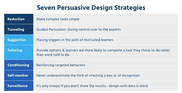
My research led me to develop what we call Persuasive Design Strategies or PDS. PDS is an offshoot of Persuasive Technology or CAPTOLOGY (Computers as Persuasive Technology) which was first articulated by B.J. Fogg, a behavioral scientist and director of Stanford University’s Persuasive Technology Lab. Fogg looked at how different mediums of digital communication such as marketing sites, eCommerce, or mobile apps use persuasive techniques to persuade visitors to buy, lose weight, or keep playing a game. While I by no means invented persuasive design, I did spend the last decade researching and testing how Fogg’s techniques can be aligned to proven instructional design strategies and user experience design methodology. The result is the development of a set of design strategies we use every day in building out digital learning environments. We believe the design of the overall learning environment is just as important as the information it contains and have adopted these seven strategies of PDS as our guiding principles.
The term persuasion can feel out of place when discussing instructional endeavors, but it is important to note that persuasion is not coercion, and, in fact, has played a role in education since the days of Socrates. Persuasive Design is about the intent of the designer.
Seven Strategies of PDS
Before I walk through PDS, it is worth mentioning that it is not about a particular platform or some new technology that requires fancy algorithms. While recent AI-powered solutions may enhance the tools available to designers PDS is about the strategic intent of the designer, or more importantly, designing with the intent to persuade behaviors in the learning environment to reduce frustration and increase engagement, and thus, positively improve mastery.

Reduction
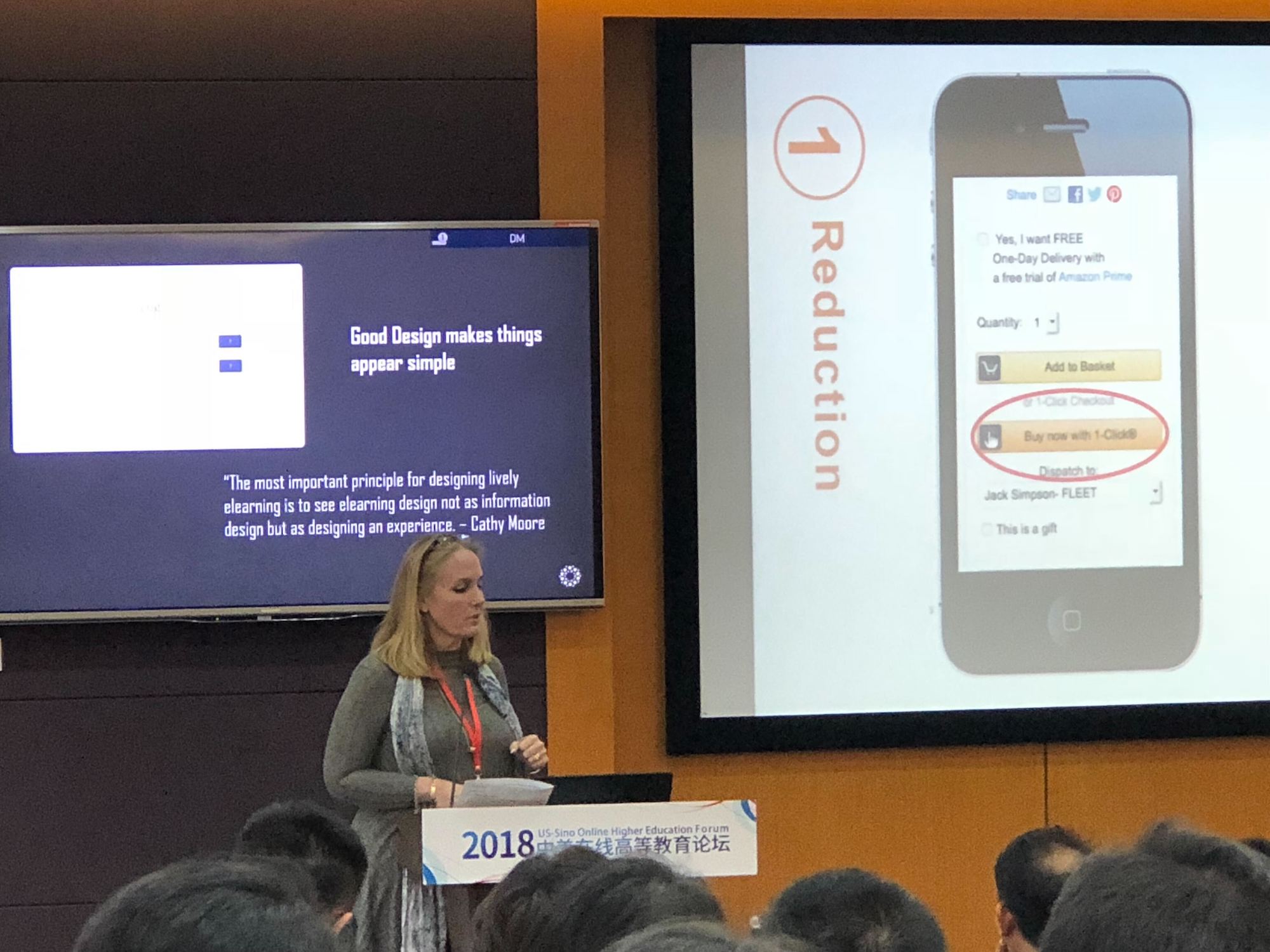
One of the most important strategies. Learners often are required to jump through several hoops just to get to their course. Navigating a site and parsing the content shouldn’t be a chore. Reducing the cognitive load on a learner is vital. If you make something simple to do, learners are more likely to do it (like Amazon OneClick for example).
One common area where we look to apply Reducation, is the decisions made for user authentication which is often one area that is overlooked but can make a huge impact. As the first task a learner is required to complete, making it simple means that a learner won’t be frustrated before they can even enter the site.
Another mistake that many digital learning sites often make is to try to provide all the options that a learner might need on every page. The result is that the learner is overwhelmed and unsure of what their next step should be. A clean and simple interface that uses reduction will easily show them where they need to go for all their needs.
Tunneling
Tunneling refers to the practice of directed guidance through an experience. Ideally, this structure of guidance should be almost invisible to the learner. This is much like the process of updating software on your computer. The system walks you through informed steps but provides structure along the way. This is not a new strategy for educators. However, it is worth noting that tunneling, if overused, can have the opposite desired effect.
A common misuse of tunneling is when a learner is forced into a never-ending loop of review and “try again” prompts in an effort to complete a lesson. If the desired behavior is for learners to review material and achieve mastery, reviewing the material should not feel punitive.
Suggestion
Suggestion is a strategy that is all about the kairos (the timing), where information is presented to learners at the right time to be most effective in changing their behavior. In other arenas, this can be seen in the use of recommendation engines that often require complex algorithms. As a design strategy, a simpler approach can be taken and produce similar results. In short, suggestions are triggers placed in the path of motivated learners used to persuade behavior and keep them engaged.
For example, if your learners are allowed to self-enroll in courses, having a list of recommended courses would be a gentle push to encourage ongoing utilization. This information could be based on information stored in their profile or based on the courses they’ve already completed.
Tailoring
Tailoring is a strategy that allows for an experience to be tailored to the individual learner. Choice and personalizing the environment are the two main ways to do this. Often combined with suggestions, we see examples of this in providing multiple suggestions and allowing learners to select the one that interests them. We’ve all seen the “You may also like one of these top three items purchased together” types of messages. Why not suggest learning “options” and let learners make a choice when possible?
Tailoring can also be done by the platform or through utilizing AI, creating a more personal experience for each individual in ways as simple as calling them by name or remembering what they have recently viewed. Small changes like a personal greeting when they log in can transform the site into a social actor that participates in their learning process. Showing content or instructions that pertain to an individual’s needs creates a feeling of connection to the environment that translates into increased engagement.
A common way we combine reduction, suggestion, and tailoring is seen in our approach to designing feedback. An example: suggesting a learner review content they have gotten incorrect in a quiz and placing a link in the feedback for where to go to review combined with offering them the option to simply move on to the next question. This simple combination of strategies makes a suggestion to review, provides learner choice, and makes accepting either path simple and easy to do.
Self-Monitoring
With self-monitoring, learners are made aware of their progress as a way to persuade them to complete their goals. We’ve already seen examples throughout our industry about the use of gamification as a way to pull in techniques used in app and game design. Progress bars and checklists are a common occurrence in web design today and are often used to monitor a user’s task completion. However, the strategy behind when and how we decide to use them in the design of a digital learning experience can make all the difference.
Badges and certificates are another way to persuade learners to complete tasks or courses. Again the real power of PDS is seen when we think through the different strategies for when and how they are used. For example, certificates might be awarded for completion of a task or course. So any learner who completes a course with a passing score can earn a certificate. However, a badge could be awarded to learners who complete the course with a grade of 95 or higher. The trick is letting them know in advance what potential badges are available, this is how you persuade the behavior for them to do what is necessary to earn them.
Conditioning
This is a simple but powerful strategy that is all about how to encourage and reinforce targeted behaviors. When it comes to conditioning there is a lot we can learn from digital game design to apply to designing digital learning: from when and how to use rewards to avoid reward fatigue to consistent design choices and the use of course templates that build trust and help to create good habits.
A great example of conditioning can be shown with a user profile. Learners are given instructions to complete their profiles. The learners who follow the directions and the behavior you want to encourage are rewarded with access to the rest of the site. Learners who do not follow the directions could be limited to a few areas of information and cannot access areas they need or want. Remembering that to condition behavior change you’ll want to let them know why their access is limited.
Surveillance
Surveillance refers to the collection of data about learner behavior and performance results. If information is power, then giving that power to learners can be one of the most persuasive strategies of all. If the government asked all citizens to submit a DNA sample to a database I doubt many of us would comply, yet many of us will pay for a pretty colorful graph that tells us all about our family history based on sending in our DNA sample.
The use of the term surveillance is intentionally provocative, especially when we are talking about learning environments, but remember surveillance is only creepy if you don’t share your findings with the ones you are surveilling.
People can be very competitive and tapping into that competitiveness can in many cases be a good motivator. Leaderboards are a type of surveillance strategy that uses gamification to award points for specific behaviors. It’s also a great way to combine conditioning and reward positive behavior.
Conclusion
A few key points to recap:
- First, Persuasive Design Strategies do not, and in fact should not, be used as stand-alone strategies. They work best when combined together in meaningful ways.
- Second, PDS is about the purposeful intent of the designer and not about the tools or products they use. However, I will say that learning experience platforms designed to support the use of PDS, can produce more consistent results.
- And finally, PDS is about thinking and designing holistically the entire digital learning environment to persuade learners to be in the optimum learning state of mind.


